All Solutions
Page 348: Media Vocabulary
The bar chart presentation provides all of the information needed to compare how press declined and to what extent it had declined. As we can see, Libya and Thailand experienced the most threats to journalists and a free press while the countries at the top of the list (e.g. Venezuela or Turkey) did not experience a dramatic change (however, we should note that they are still at the top of experiencing media repression and threats to a free press).
Having the data aggregated in this form makes it more organized and easier to develop conclusions.
The presentation utilizing a line graph shows us the data points over a period of time that was examined (in this case, a ten year period beginning in 2004 and ending in 2014). By connecting the data points, we can easily see the changes between specific years as well as the entire decade that was examined. While press freedom had improved between 2010 to 2011, it has generally shown an overall decline from 2004 to 2014.
When we examine the infographics in Figure 3, we can see similarities between the figures and a pie chart. For Global-status by country, the total number of countries examined is 199. Each set is then divided into different segments (e.g. countries with a free press constitute 63 countries which make up 32% of the total).
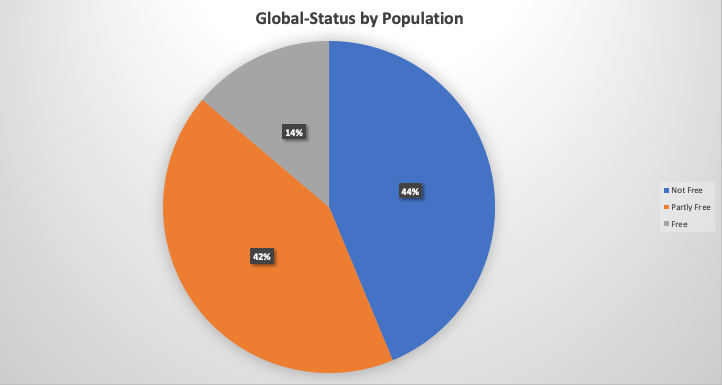
Similarly, the Global-status by population utilizes the same approach. The Not Free comprises a larger number (44% or 3,162,940,027 people) and is displayed as a larger rectangle. Compare this with the Free rectangle which is smaller (comprising only 14% of the population).
In a pie chart, a larger percentage would form a larger segment of the pie while a smaller percentage would form a smaller segment of the pie.
When we examine the infographics in Figure 3, we can see similarities between the figures and a pie chart. For Global-status by country, the total number of countries examined is 199. Each set is then divided into different segments (e.g. countries with a free press constitute 63 countries which make up 32% of the total).
Similarly, the Global-status by population utilizes the same approach. The Not Free comprises a larger number (44% or 3,162,940,027 people) and is displayed as a larger rectangle. Compare this with the Free rectangle which is smaller (comprising only 14% of the population).
In a pie chart, a larger percentage would form a larger segment of the pie while a smaller percentage would form a smaller segment of the pie.
Please see solution for an example of a pie chart using the data.
